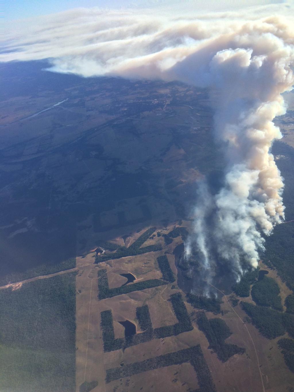
(pictures credited to an unknown Twitter user)
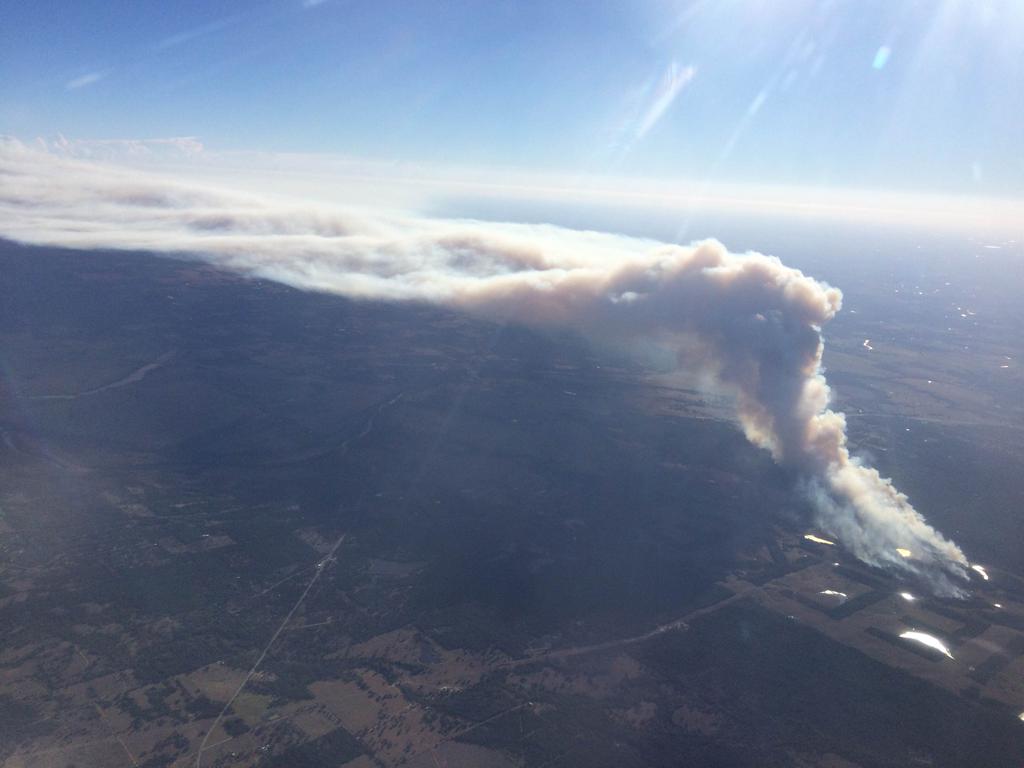
Look at the 3rd picture in particular. Notice how the smoke seems to stop rising and instead gets carried downstream by the mid-level winds? It's almost like that smoke hit a ceiling and couldn't get any higher. In effect, it did! This is a perfect illustration of a temperature inversion. Temperature inversions are not uncommon and are the cause of thunderstorm anvils and in some cases fog!
You see, when a chunk of air (the technical term is parcel) is warmer than the air around it, it's considered to be buoyant and so it rises. Smoke from wildfires is hot - much hotter than the environmental temperature - so up into the air it goes. The smoke will continue to rise until it hits a level in the atmosphere which is the same temperature or warmer than itself. At this point, the smoky air is no longer buoyant so it stops rising. Incidentally, This is the same reason why cumulus clouds only grow so tall - because the updrafts which created them cool down and become the same temperature as their environment.
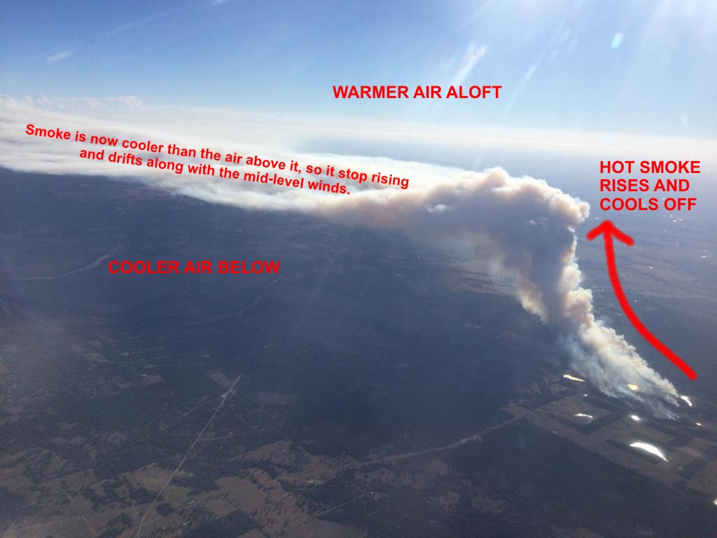
Here's an annotated version of the Bastrop County wildfire.
But why is this called an "inversion"? To illustrate this, let's break out the old Skew-T chart. I've referenced this before many times. A Skew-T is a meteorological chart used for viewing the vertical temperature profile from ground level to upper atmosphere; a cross-section of the atmosphere in essence. Under normal conditions, the air at the surface is warm (relatively speaking) and will cool off the higher you go into the atmosphere. Graphed on a Skew-T diagram a standard temperature plot would look like this.

See the red line? This is the vertical graph of air temperatures. This chart was from the DFW area on 10/13/2015 at around 7 PM. The line generally runs from right to left the higher up you go. The temperature lines are "skewed" to the right, hence the name Skew-T (Temperatures are in Celsius, notated at the bottom of the chart). Let's now compare that image to this.

This is from 10/14/2015 at 7 AM - about 12 hours after the previous example. Notice how the bottom of the red line starts to go to the right and then curves back around? This demonstrates that the layer of air near the surface actually gets warmer with height! This is the temperature inversion! In this particular example, the air near the surface cooled down significantly overnight (22 degrees from the previous evening), yet the air aloft remained warm. As an aside, if the air near the surface had more moisture, it would be this same type of atmospheric setup responsible for fog.
-Andrew
P.S. Anyone notice the letters on the ground in the first picture of the wildfire? More info here!
UPDATE: The smoke plume from the fire was visible on satellite today.

10/15/2015 Update: Taking the kids to the bus stop this morning, I was hit with the distinct smell of smoke - almost like somebody had a fire going. The smoke from the Bastrop county wildfire had made it as far as the DFW area. Looking at the visible satellite imagery from this evening, here's why:
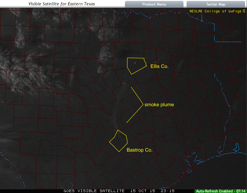
The smoke plume was drifting directly towards us! I wouldn't be surprised if I woke up to another smoky morning....
No comments:
Post a Comment