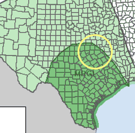
I'm going to preface this post by saying that I'm NOT a weather forecaster, nor do I pretend to be one. However, in my self-study of weather, I've noticed certain ingredients that when added together in just the right amounts can make for some unsettled weather. The problem is of course is that the weather is ALWAYS changing and what looks good today, may not look good when the time comes. Here's what I'm mean. Confidence is increasing that Friday, October 30, 2015 will be another rainy day for North Texas. However, there is a chance, albeit low at this time, for severe weather. This is the SPC Outlook for Day 3 - Friday, October 30, 2015. Already, some parts of north Texas are shown in the MARGINAL RISK area.
The enlarged view shows a good portion of the DFW Metroplex under the MARGINAL RISK area including Tarrant, Johnson, Ellis, and parts of Dallas county.
Severe weather requires 4 key ingredients: moisture, lift, instability, and wind shear.
Let's look at the ingredients in more detail:
NOTE: All images are taken from the GFS weather model, 06Z initialization on 10/28/15 @ 21Z (4 PM)
MOISTURE
In order for it to rain, you need moisture! For that we can look at the forecast dew points.
This image shows forecast dew points for North Texas in the low to mid-60s - which is plenty of moisture in the atmosphere for severe weather.
LIFT
The jet stream is a fast-moving "river" of air in the upper atmosphere which impacts our weather. The shapes the jet stream can take are a result of high and low pressure areas. A trough is a large U-shaped structure in the jet stream which indicates a low pressure area - generally responsible for poor weather. When wind approaches a low pressure center, it tends to slow down around around the center region, then quickly speed up and eject out of it. This image is taken from the GFS weather model and shows the predicted winds at 500 mb (millibars - a measure of pressure) or about 18,000 feet up.
The U shape is clearly visible west of Texas and the winds ejecting from it are sailing directly over us. This creates lift in the atmosphere by a process known as upper level divergence. An oversimplified example of this is a line of cars accelerating at a green light. As the cars begin to speed up, the distances between them gets larger. In the atmosphere, when the wind "diverges" high up, winds from below are lifted up to fill those "gaps". Lift helps to raise air up so it'll cool, condense, and rain.
INSTABILITY
Instability is a measure of the tendency of air to be lifted. This is highly dependent on temperature and moisture. If the temperatures above us don't cool down in fast enough going up in to the atmosphere, this impedes surface air from wanting to rise. In this case, we say the air is stable. If air is unstable (a higher instability number), air will have a tendency to rise. This chart shows a forecast sounding (a vertical temperature and moisture profile) for central Hill County on Friday at 4PM.
Note the blue line. See how it doesn't go very far to the right of the red line, if at all? At a very basic level, this means that there will not be a large amount of instability in the atmosphere. This factor alone is a large reason why the severe weather chances are low. If that blue line were much further to the right - creating a large space between itself and the red line, severe weather chances would most certainly increase. But again, this is a forecast weather model and not a direct measurement (it's in the future keep in mind), so things are of course subject to change.
WIND SHEAR
Wind shear is a change in wind speed (speed shear) or direction (directional shear) with height. In other words, winds at the surface tend to change direction and/or speed the higher you go in to the atmosphere. It's not uncommon to have winds coming out of the south or southeast at ground level and winds coming from the west at 500 mb (18,000 ft). Wind shear plays a large role in the longevity and strength of severe storms.
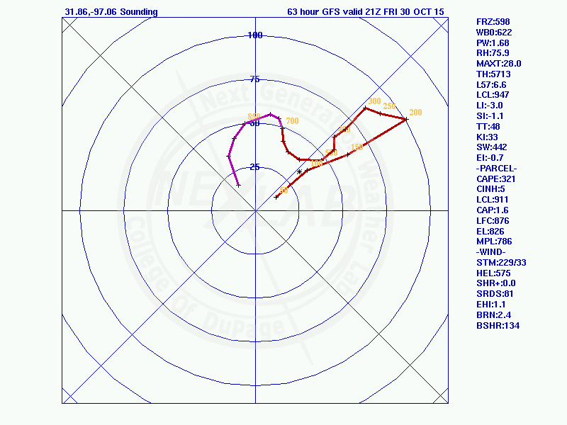
To get a good look at wind shear, we can use a something called a hodograph which plots wind speeds in a certain way on a circular graph. The shape of these wind speeds can give a good indication of the type severe storm and even if the possibility of tornadoes exists.
Without getting into all the nuts and bolts, the key thing about this image is the large circular shape in purple. This is the graph of the forecast lower level winds. The strength and shape of this curve indicates that at this time, (assuming that all other ingredients come in to play) that tornadoes are possible. Keep in mind that A LOT has to go right for tornadoes to develop - much the same way that in addition to flour, lots of ingredients have to come into play to make a cake.
As I mentioned before, this is just one slice on information from one specific weather model and is NOT meant the be an authoritative forecast. In fact, this is probably wishful thinking on my part and are a result of me wanting to chance some storms! While the wind shear, lift, and moisture look promising, the lack of instability may turn this whole event sour. Regardless, let's see how these ingredients shape up and keep an eye to my Faceook page for more up-to-date info!
-Andrew
Welcome to my blog! I hope to share some cool experiences with you about my love for weather - and if you learn something along the way - all the better. Thanks for visiting!
Wednesday, October 28, 2015
Wednesday, October 14, 2015
Bastrop County Wildfire Smoke Demonstrates Temperature Inversion
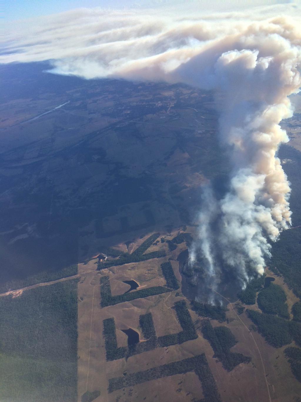
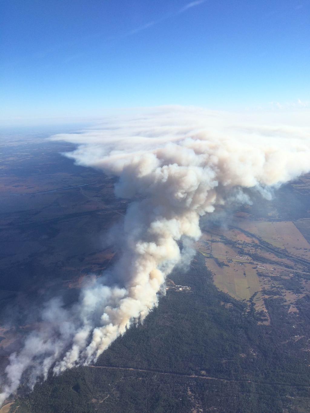
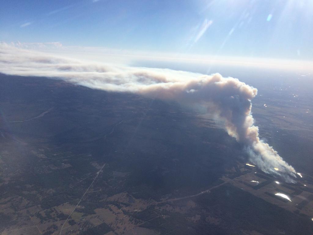
Bastrop County, Texas (about 190 miles south of DFW) is yet again dealing with severe wildfires. Back in 2011, that same area suffered through what became the most destructive series of wildfires in Texas history. Luckily the current blaze is nowhere near that size. What spurred me into writing this post, however, wasn't the fire itself but the smoke from the fire. The following pictures were snapped by an airline passenger who happened to be flying in the vicinity of the fire. This person proceeded to tweet them to an Austin-area TV station and from there they made it around the Twitterverse.
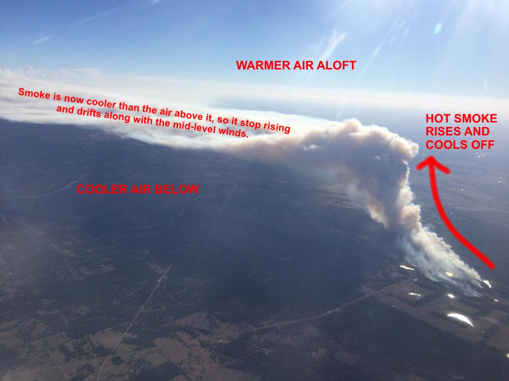
You see, when a chunk of air (the technical term is parcel) is warmer than the air around it, it's considered to be buoyant and so it rises. Smoke from wildfires is hot - much hotter than the environmental temperature - so up into the air it goes. The smoke will continue to rise until it hits a level in the atmosphere which is the same temperature or warmer than itself. At this point, the smoky air is no longer buoyant so it stops rising. Incidentally, This is the same reason why cumulus clouds only grow so tall - because the updrafts which created them cool down and become the same temperature as their environment.
Here's an annotated version of the Bastrop County wildfire.
But why is this called an "inversion"? To illustrate this, let's break out the old Skew-T chart. I've referenced this before many times. A Skew-T is a meteorological chart used for viewing the vertical temperature profile from ground level to upper atmosphere; a cross-section of the atmosphere in essence. Under normal conditions, the air at the surface is warm (relatively speaking) and will cool off the higher you go into the atmosphere. Graphed on a Skew-T diagram a standard temperature plot would look like this.
See the red line? This is the vertical graph of air temperatures. This chart was from the DFW area on 10/13/2015 at around 7 PM. The line generally runs from right to left the higher up you go. The temperature lines are "skewed" to the right, hence the name Skew-T (Temperatures are in Celsius, notated at the bottom of the chart). Let's now compare that image to this.
This is from 10/14/2015 at 7 AM - about 12 hours after the previous example. Notice how the bottom of the red line starts to go to the right and then curves back around? This demonstrates that the layer of air near the surface actually gets warmer with height! This is the temperature inversion! In this particular example, the air near the surface cooled down significantly overnight (22 degrees from the previous evening), yet the air aloft remained warm. As an aside, if the air near the surface had more moisture, it would be this same type of atmospheric setup responsible for fog.
-Andrew
P.S. Anyone notice the letters on the ground in the first picture of the wildfire? More info here!
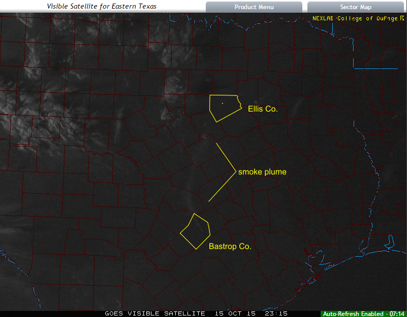
UPDATE: The smoke plume from the fire was visible on satellite today.
10/15/2015 Update: Taking the kids to the bus stop this morning, I was hit with the distinct smell of smoke - almost like somebody had a fire going. The smoke from the Bastrop county wildfire had made it as far as the DFW area. Looking at the visible satellite imagery from this evening, here's why:
(pictures credited to an unknown Twitter user)
Look at the 3rd picture in particular. Notice how the smoke seems to stop rising and instead gets carried downstream by the mid-level winds? It's almost like that smoke hit a ceiling and couldn't get any higher. In effect, it did! This is a perfect illustration of a temperature inversion. Temperature inversions are not uncommon and are the cause of thunderstorm anvils and in some cases fog!
You see, when a chunk of air (the technical term is parcel) is warmer than the air around it, it's considered to be buoyant and so it rises. Smoke from wildfires is hot - much hotter than the environmental temperature - so up into the air it goes. The smoke will continue to rise until it hits a level in the atmosphere which is the same temperature or warmer than itself. At this point, the smoky air is no longer buoyant so it stops rising. Incidentally, This is the same reason why cumulus clouds only grow so tall - because the updrafts which created them cool down and become the same temperature as their environment.
Here's an annotated version of the Bastrop County wildfire.
But why is this called an "inversion"? To illustrate this, let's break out the old Skew-T chart. I've referenced this before many times. A Skew-T is a meteorological chart used for viewing the vertical temperature profile from ground level to upper atmosphere; a cross-section of the atmosphere in essence. Under normal conditions, the air at the surface is warm (relatively speaking) and will cool off the higher you go into the atmosphere. Graphed on a Skew-T diagram a standard temperature plot would look like this.
See the red line? This is the vertical graph of air temperatures. This chart was from the DFW area on 10/13/2015 at around 7 PM. The line generally runs from right to left the higher up you go. The temperature lines are "skewed" to the right, hence the name Skew-T (Temperatures are in Celsius, notated at the bottom of the chart). Let's now compare that image to this.
This is from 10/14/2015 at 7 AM - about 12 hours after the previous example. Notice how the bottom of the red line starts to go to the right and then curves back around? This demonstrates that the layer of air near the surface actually gets warmer with height! This is the temperature inversion! In this particular example, the air near the surface cooled down significantly overnight (22 degrees from the previous evening), yet the air aloft remained warm. As an aside, if the air near the surface had more moisture, it would be this same type of atmospheric setup responsible for fog.
-Andrew
P.S. Anyone notice the letters on the ground in the first picture of the wildfire? More info here!
UPDATE: The smoke plume from the fire was visible on satellite today.
10/15/2015 Update: Taking the kids to the bus stop this morning, I was hit with the distinct smell of smoke - almost like somebody had a fire going. The smoke from the Bastrop county wildfire had made it as far as the DFW area. Looking at the visible satellite imagery from this evening, here's why:
The smoke plume was drifting directly towards us! I wouldn't be surprised if I woke up to another smoky morning....
Subscribe to:
Comments (Atom)
.gif)
